
Styleguide
A comprehensive guide to all design elements and components available in the Luno theme. Perfect for understanding the visual language and ensuring consistency across your content.
This styleguide showcases every element available in the Ghost editor. Use it as a reference to maintain visual consistency across your site and to discover the full range of design possibilities.
Typography
Typography is the foundation of great design. Luno uses a carefully balanced type system that creates hierarchy and enhances readability.
Heading Level 3
Heading Level 4
Regular paragraph text flows naturally with optimal line height and letter spacing. You can emphasize text using bold for strong emphasis, italics for subtle emphasis, or strikethrough for deprecated content. Links like Ghost.org are styled to stand out while remaining harmonious.
Ordered lists help organize sequential content:
- First item in the sequence
- Second item follows naturally
- Third item completes the pattern
Unordered lists work well for non-sequential items:
- Flexibility in design choices
- Consistency across components
- Attention to every detail
Design is not just what it looks like and feels like. Design is how it works.— Steve Jobs
Aside boxes are perfect for supplementary information, tips, or notes that complement the main content without interrupting the flow.
Tables
Tables organize data in a clear, scannable format:
| Feature | Free | Explorer | Wanderer |
|---|---|---|---|
| Weekly Newsletter | ✓ | ✓ | ✓ |
| Destination Guides | Limited | Full Access | Full Access |
| Travel Itineraries | — | 5/month | Unlimited |
| Priority Support | — | — | ✓ |
| Exclusive Retreats | — | — | ✓ |
Code
Code blocks display syntax-highlighted code snippets:
// Example: Fetching travel destinations
async function getDestinations() {
  const response = await fetch('/api/destinations');
  const data = await response.json();

  return data.destinations.filter(
    dest => dest.featured === true
  );
}
JavaScript async function example
Colors & Callouts
Callout cards draw attention to important information. Five color options help convey different types of messages:
Media
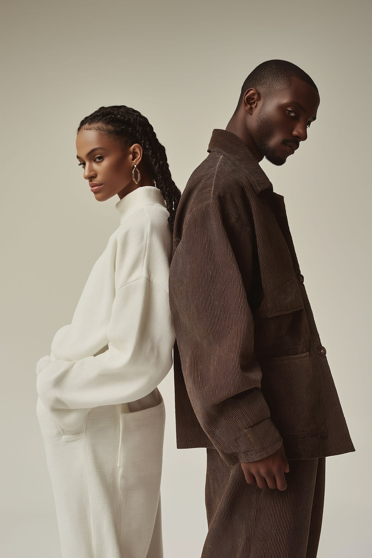
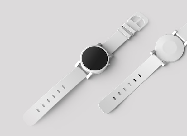
Image
Images with captions enhance visual storytelling:

Gallery
Galleries display multiple images in a beautiful grid layout:

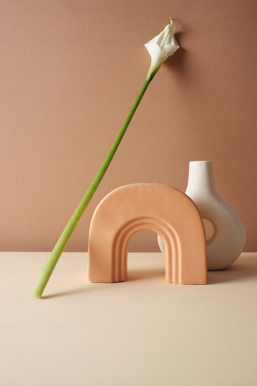

Gallery Caption
Video
Native video embeds for self-hosted content:
Video card with thumbnail and playback controls
Audio
Audio players for podcasts, music, and sound clips:
Interactive Elements
Buttons
Buttons guide users toward actions. They can be aligned left, center, or right:
Toggles
Toggle cards create expandable sections perfect for FAQs and detailed explanations:
What is a toggle card?
Toggle cards are expandable sections that help organize content. Visitors click to reveal more information, keeping your page clean while still providing depth. They're perfect for FAQs, detailed explanations, or supplementary content.
When should I use toggles?
Use toggles when you have content that not all readers need to see immediately. Common uses include frequently asked questions, technical specifications, terms and conditions, or any content that might overwhelm the page if fully expanded.
Can toggles contain rich content?
Yes! Toggle content supports full HTML formatting including bold text, italics, links, and more. You can create rich, detailed explanations inside each toggle.
File Downloads
File cards let visitors download resources directly:
Content Cards
Product Card
Showcase products with images, ratings, and purchase buttons:
Premium Design Kit
A comprehensive collection of design resources, templates, and components for modern web projects. Includes typography guides, color palettes, and UI elements.
Bookmark Card
Preview and link to external or internal content:
Embeds
Embed content from popular platforms:
YouTube
Signup Card
Signup cards help convert visitors into subscribers:

Header Cards
Header cards create bold, attention-grabbing sections: