Features
Discover all the powerful features that make Luno the perfect Ghost theme for modern publishers.
Luno is a premium Ghost theme designed for creators who demand flexibility, elegance, and performance. Every feature has been carefully crafted to help you build a stunning publication that stands out.
Flexible Design System
Take full control of your site's appearance with powerful customization options that require no coding.
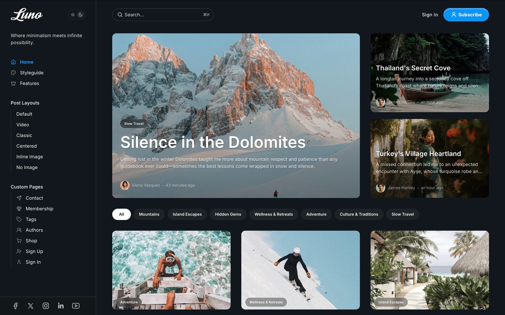
Light & Dark mode
- Color Schemes — Choose from Light, Dark, or System mode that automatically matches your visitor's device preferences
- Custom Typography — 16+ built-in fonts including Inter, Fraunces, Lora, Roboto, and more. Mix heading and body fonts for unique combinations
- Logo Variants — Upload separate logos for light and dark modes to ensure perfect visibility
- CSS Variables — Fine-tune colors, spacing, and styling through simple code injection
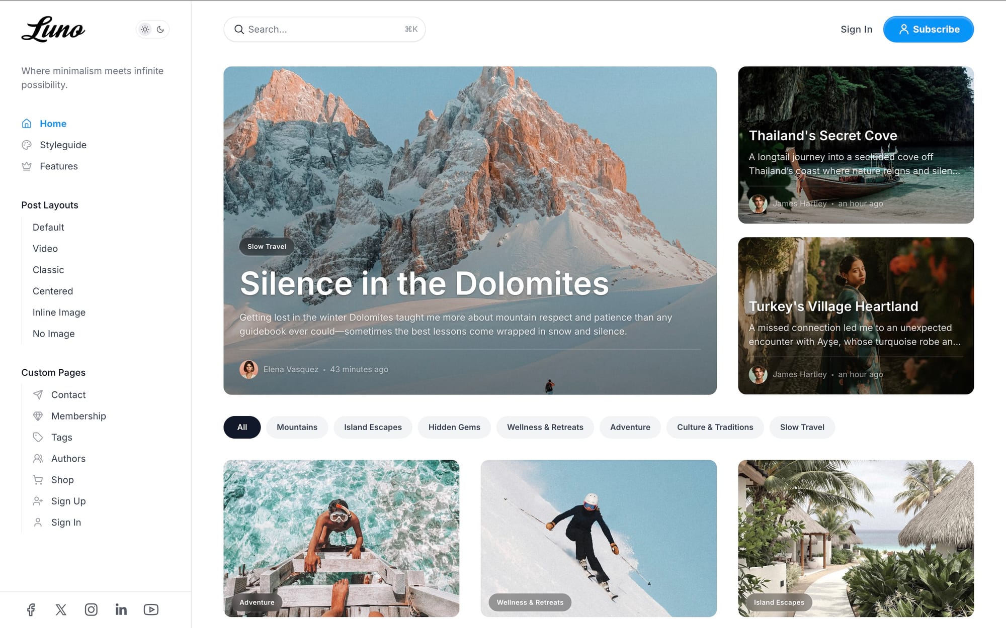
Powerful Homepage Options
Create the perfect first impression with flexible homepage components that adapt to your content strategy.
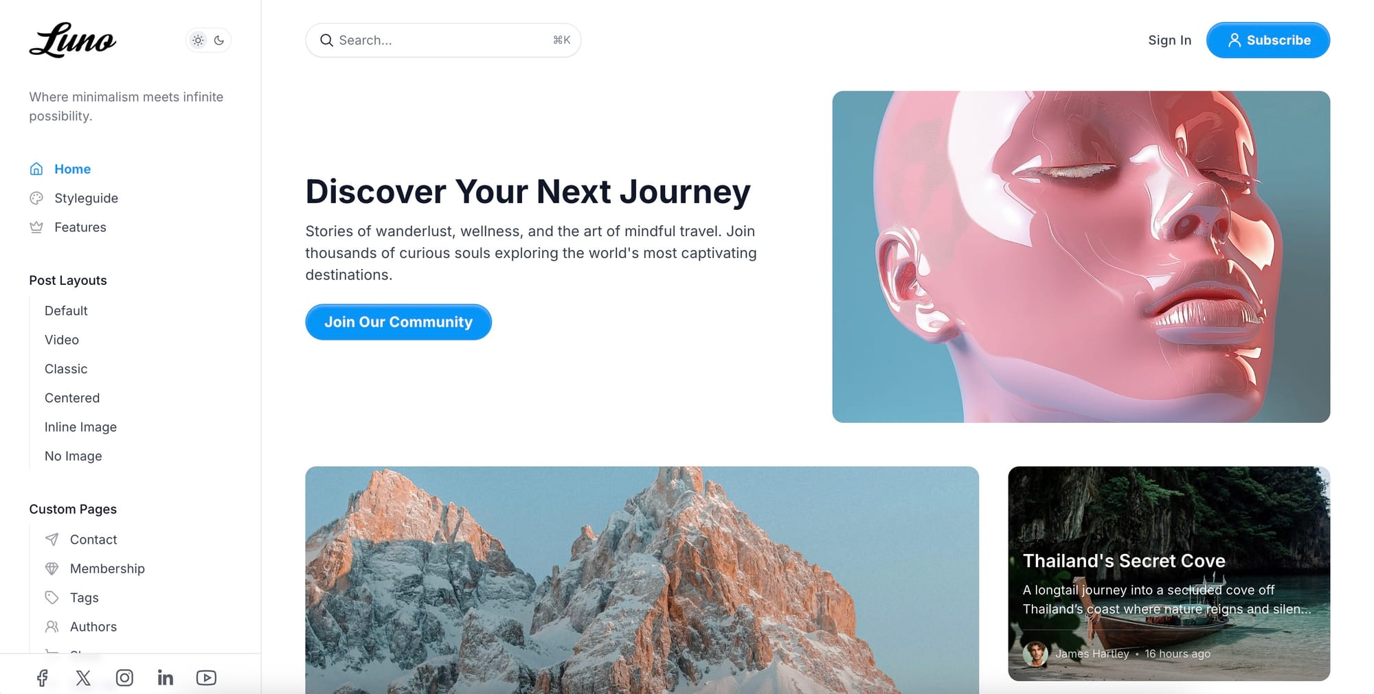
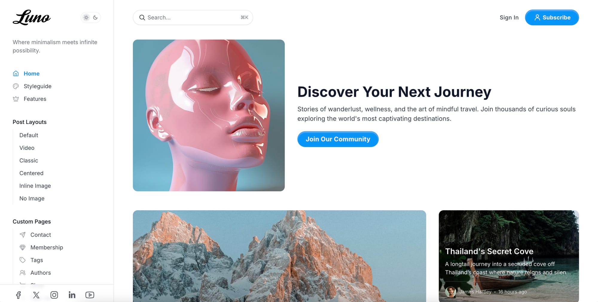
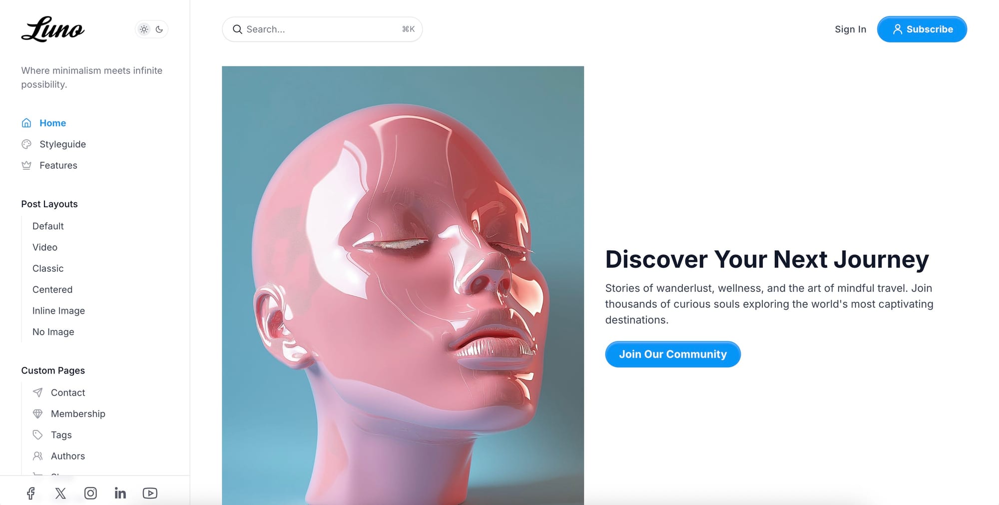
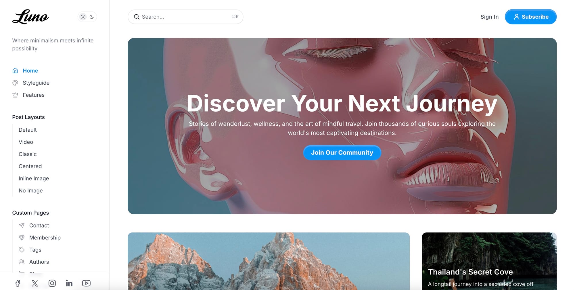
Hero Section
Five distinct hero layouts to showcase your brand message:
- Default — Side-by-side content and image
- Centered — Image above or below content
- Cover — Full-width background with overlay
- Split Start — Image left, content right
- Split End — Content left, image right
Multiple variations of Homepage Hero section
Content Discovery
Help readers find what they're looking for with intuitive navigation components:
Tags filter & Authors list on homepage
- Featured Tags — Highlight key content categories with dedicated sections
- Tags Carousel — Horizontal scrolling navigation showing top 15 tags
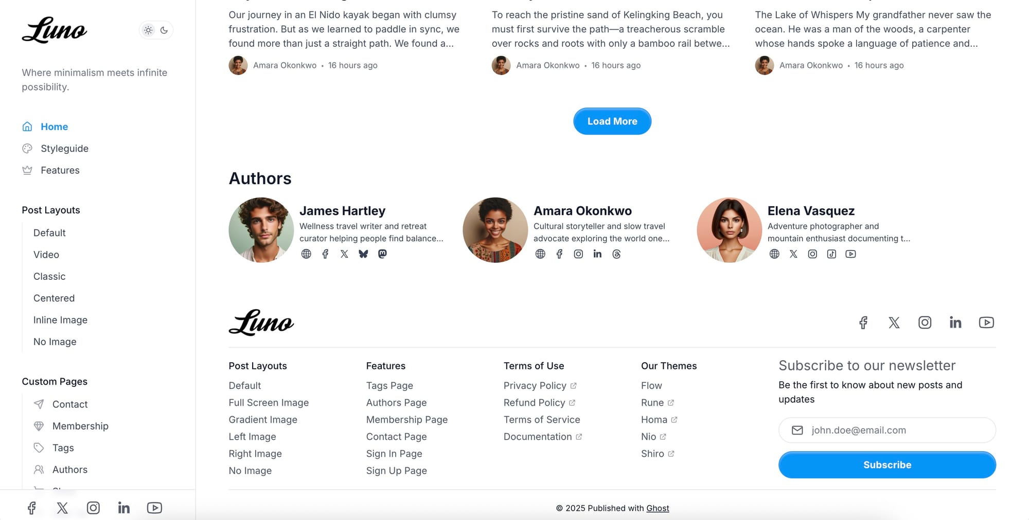
- Authors Carousel — Showcase up to 100 authors with profiles and social links
- Post Grid — Customizable aspect ratios and border radius options
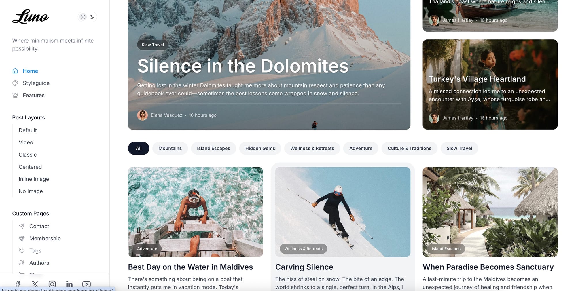
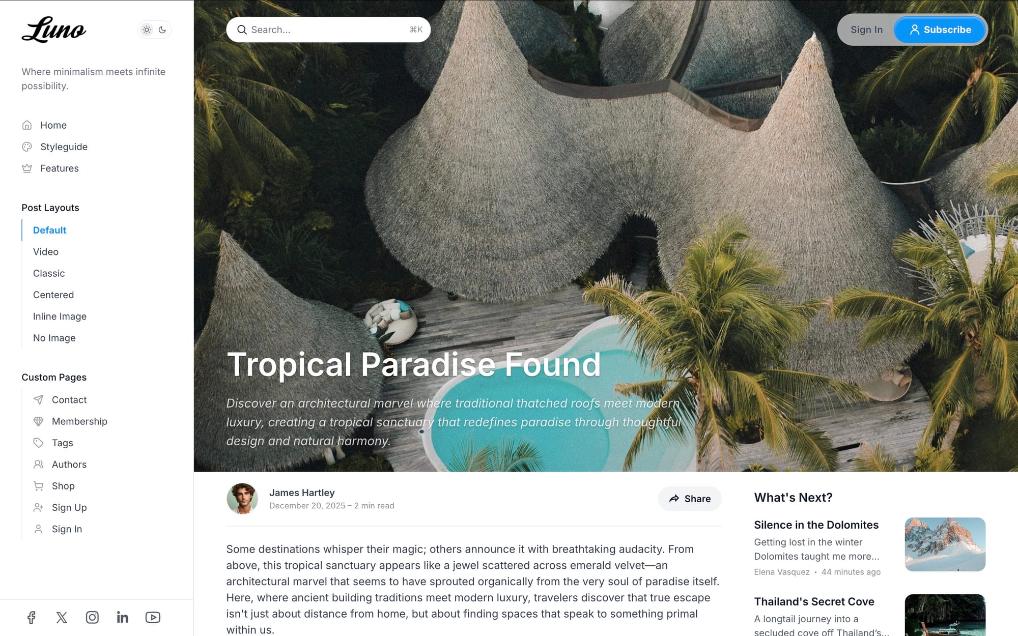
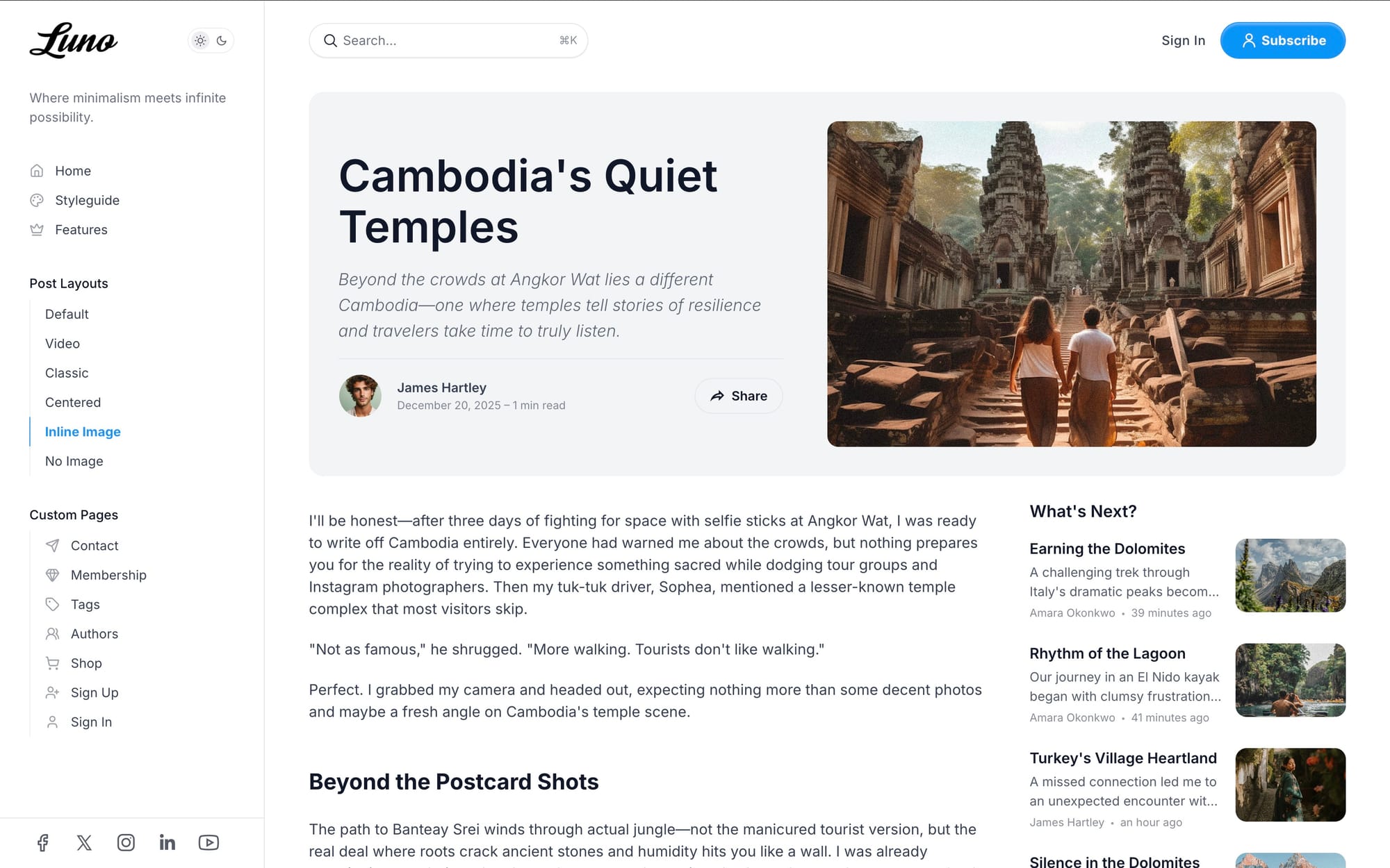
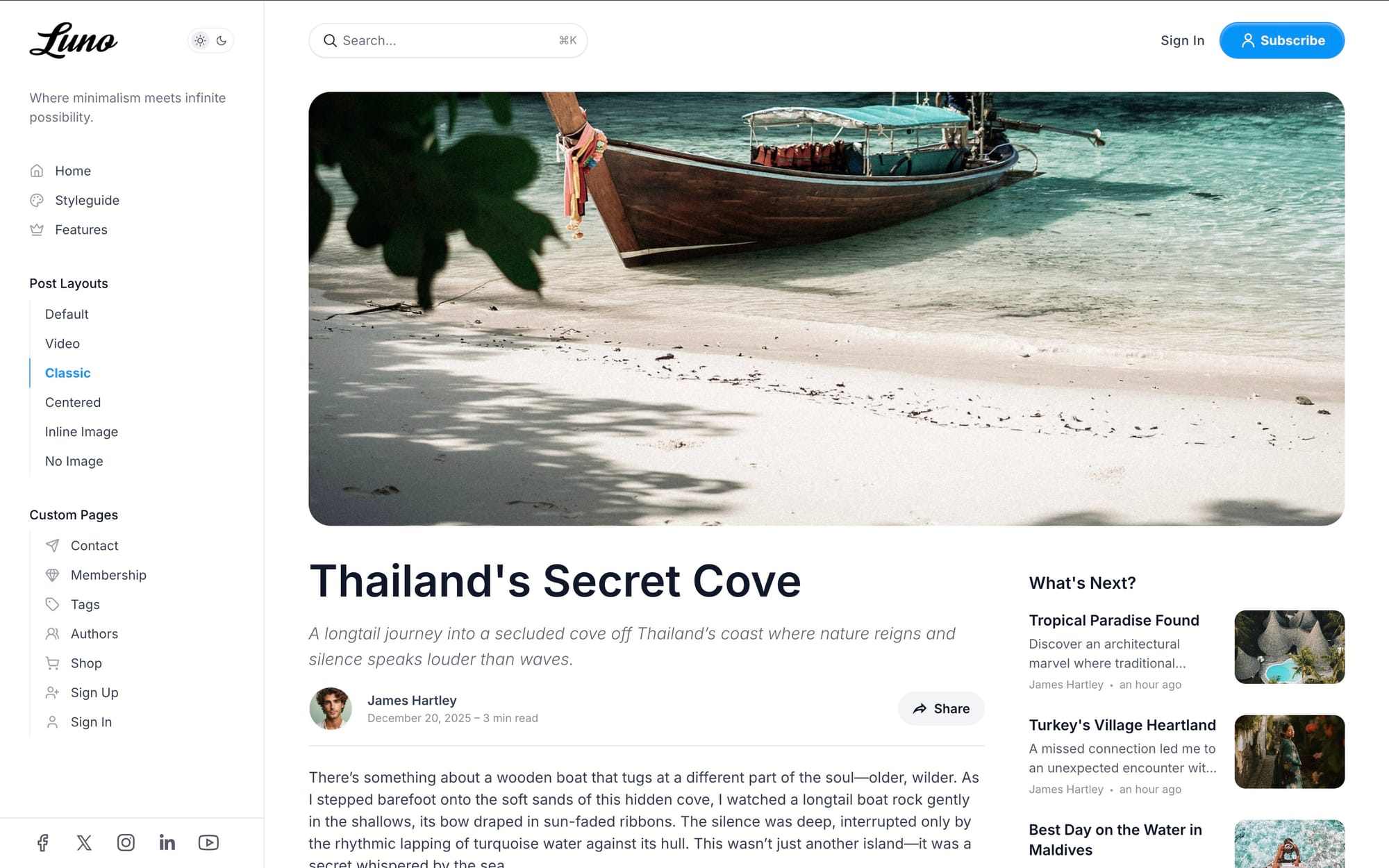
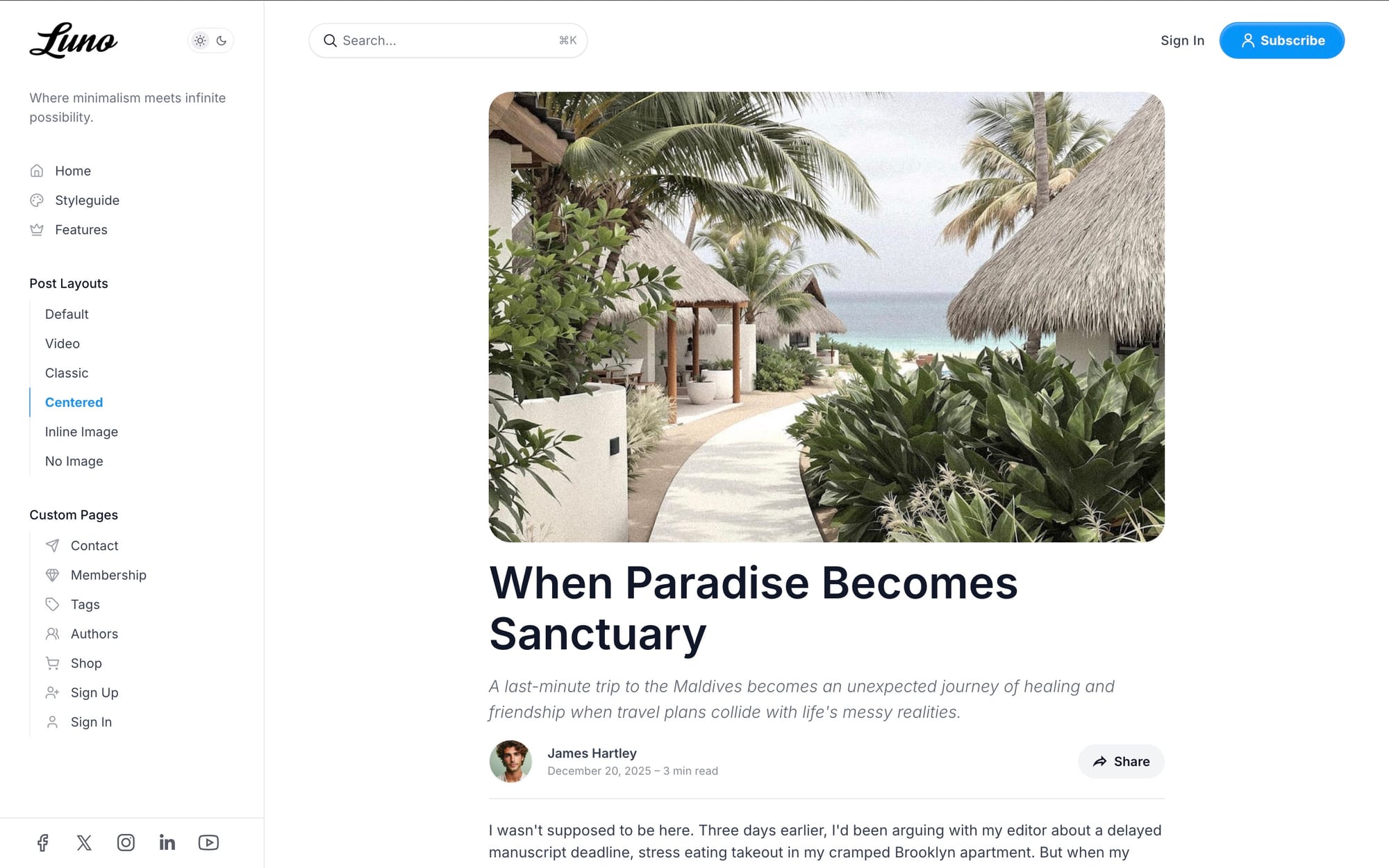
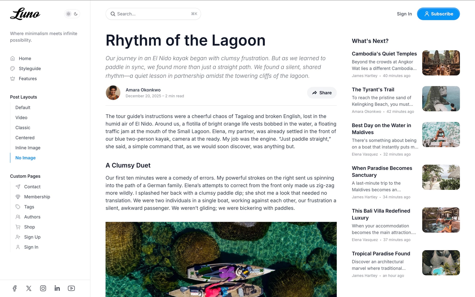
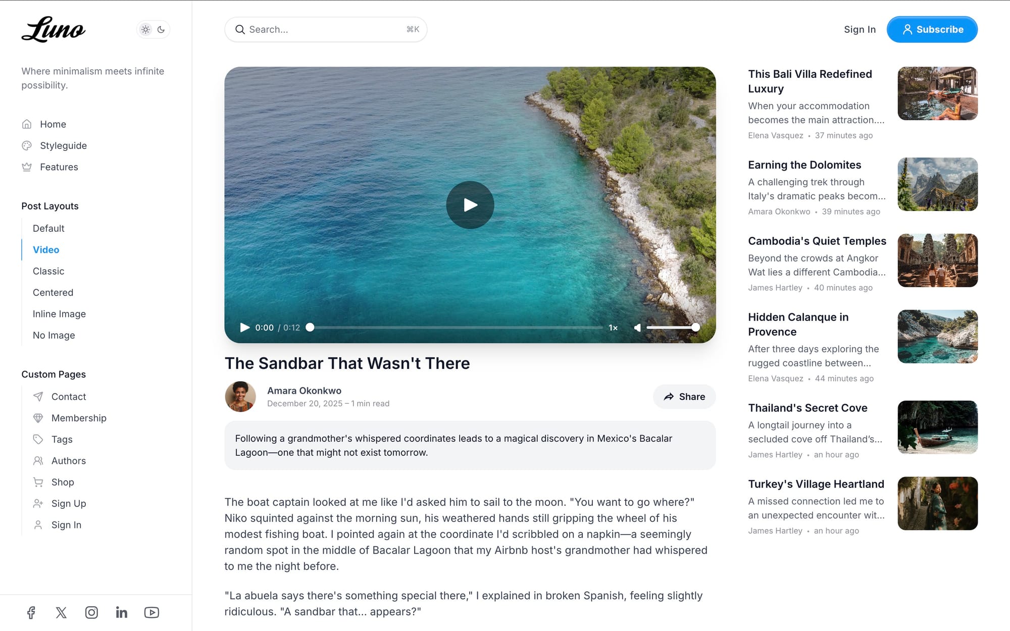
6 Beautiful Post Layouts
Every post deserves the perfect presentation. Choose from six professionally designed templates:
Different variations of post template
- Default — Feature image at top with sidebar on desktop
- Classic — Traditional blog layout with full-width feature image
- Video — First video displays in header, perfect for tutorials
- Centered — Single-column, distraction-free reading experience
- Inline Image — Feature image and title side-by-side
- No Image — Text-only layout for minimal, focused content
Purpose-Built Pages
Pre-designed page templates for every need:
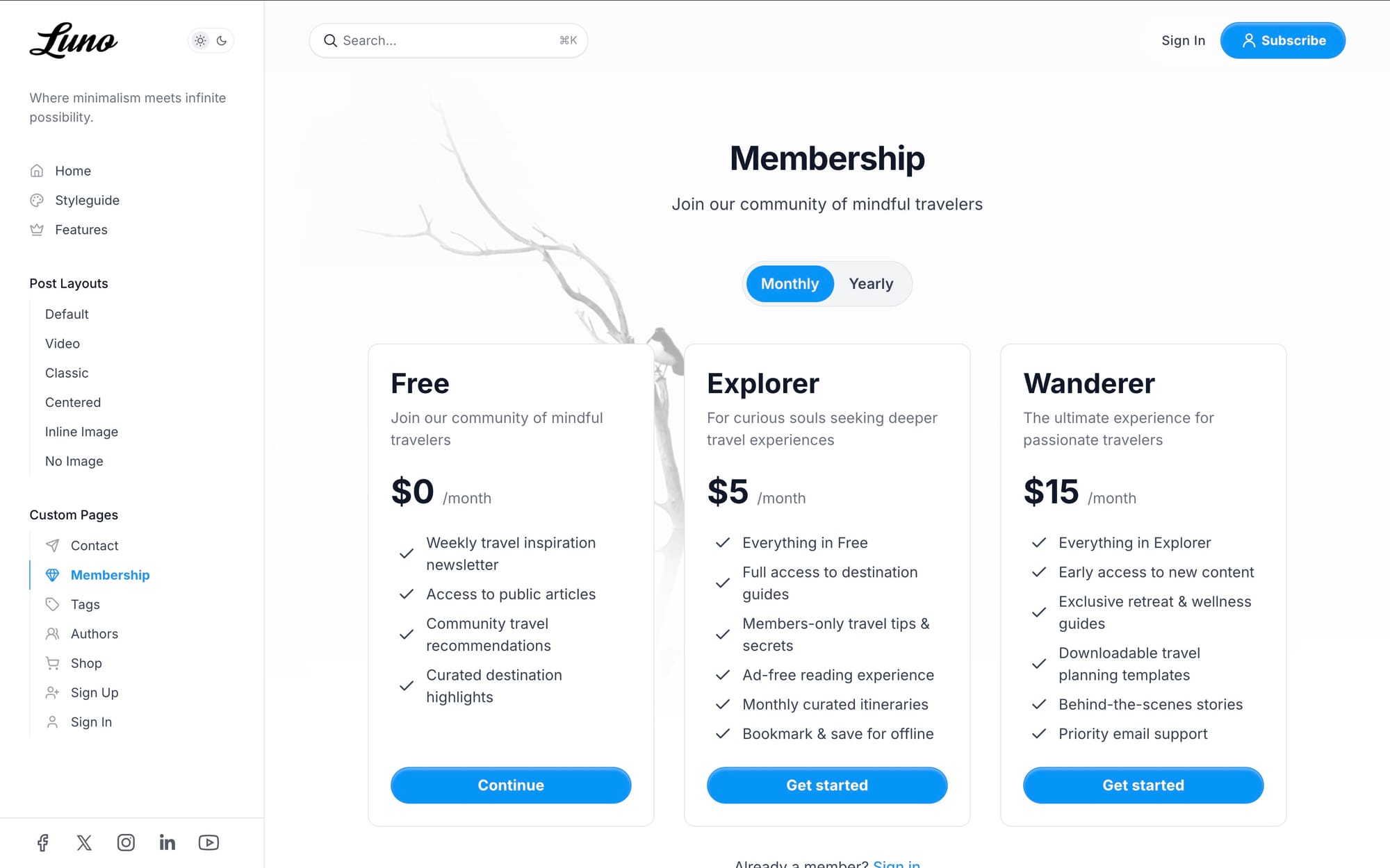
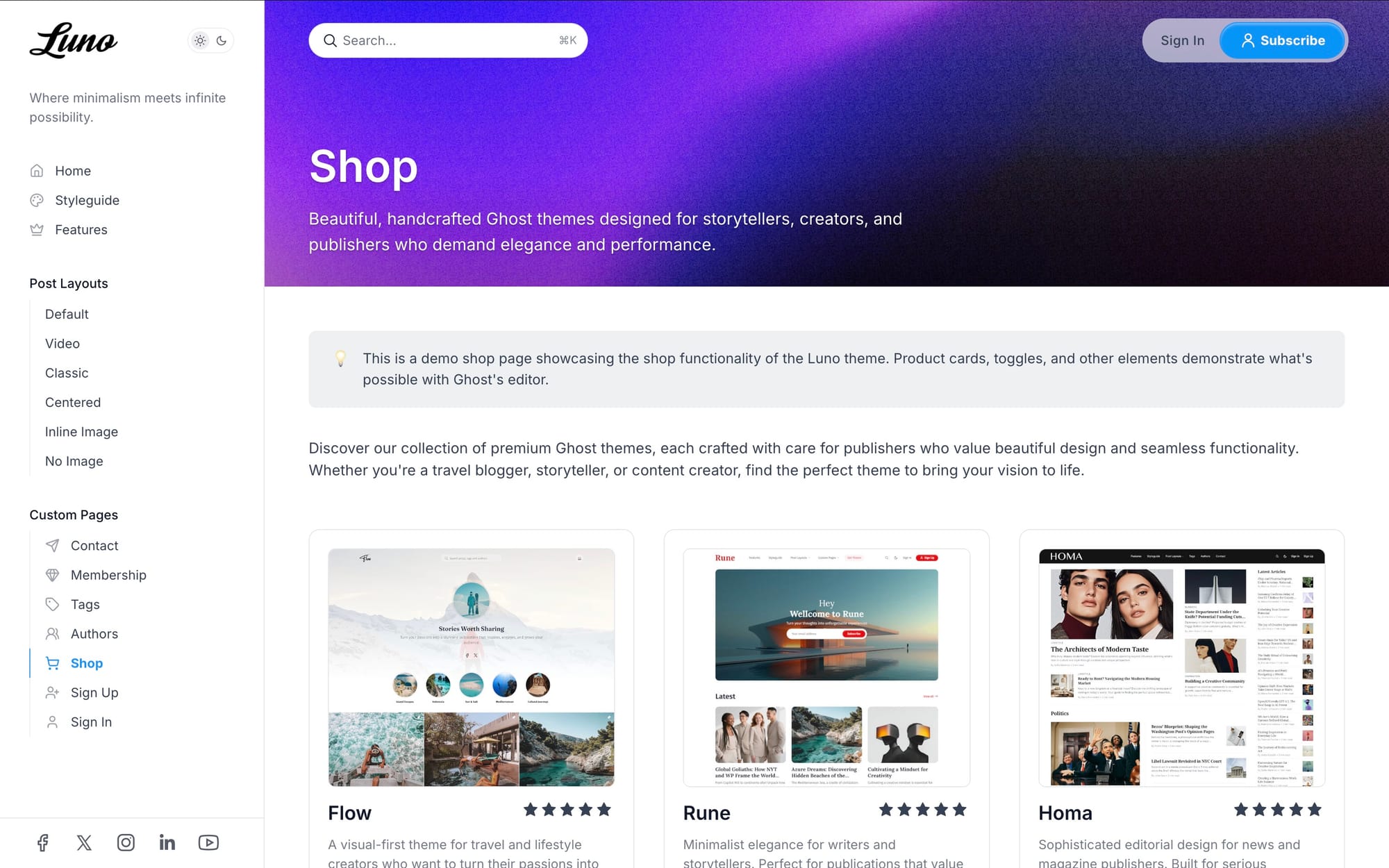
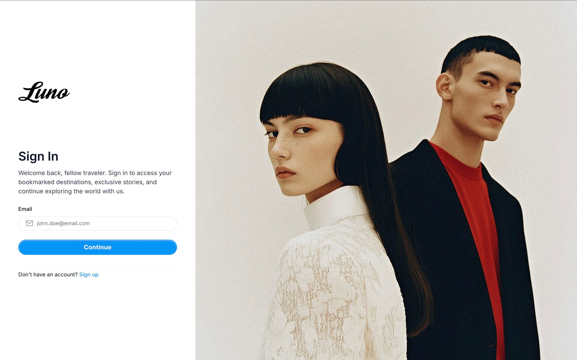
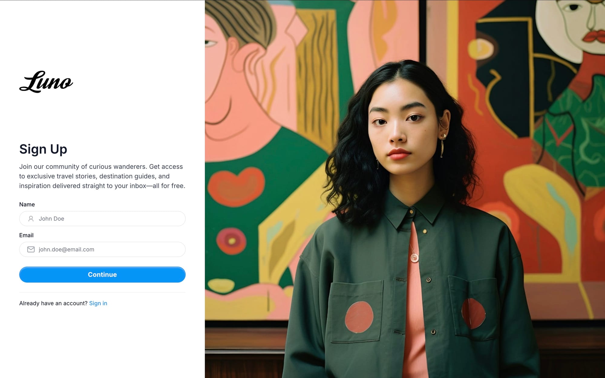
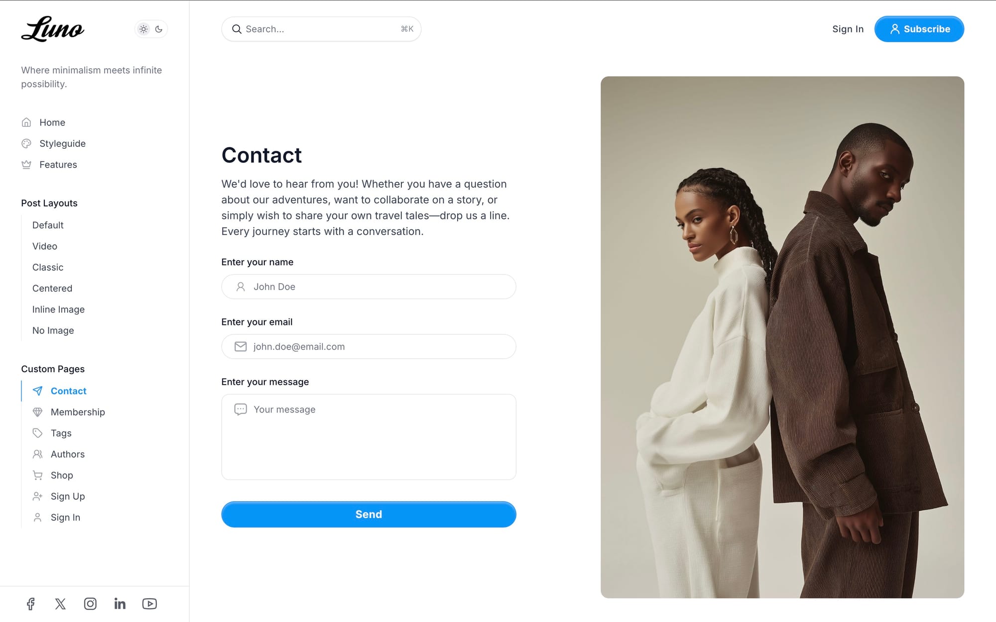
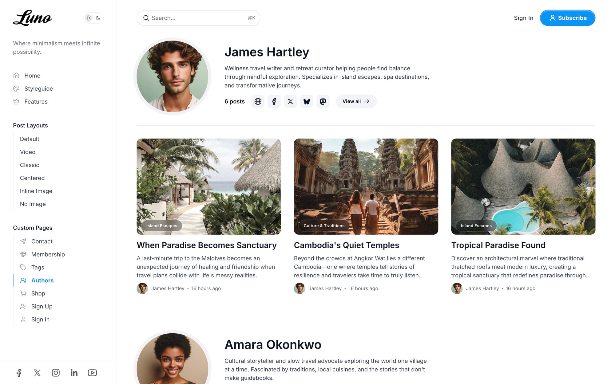
Membership, Shop, Authors, Tags, Contact, Sign In & Sign Up pages
- Authors Page — Showcase all site contributors with profiles and social links
- Tags Page — Display all content categories with descriptions
- Membership Page — Present your membership tiers beautifully
- Contact Page — Integrated form support via Formspree or Getform
- Shop Page — Responsive product grid for digital downloads and services
- Sign In Page - Customizable dedicated sign in page
- Sign Up Page - Customizable dedicated sign up page
Feels Like an App
With built-in PWA support visitors on compatible mobile browsers can install your site to their home screen for app-like instant access.
Intuitive Navigation
Guide visitors effortlessly through your content with powerful navigation features:
- Collapsible Sidebar — Clean, modern navigation that works on all devices
- Icon Support — Lucide icon library with 1000+ icons for menu items
- Keyboard Search — Quick access with ⌘K (Mac) or Ctrl+K (Windows)
- Hierarchical Menus — Group headers and sub-items for organized navigation
- Footer Navigation — Multi-column secondary links with custom groupings
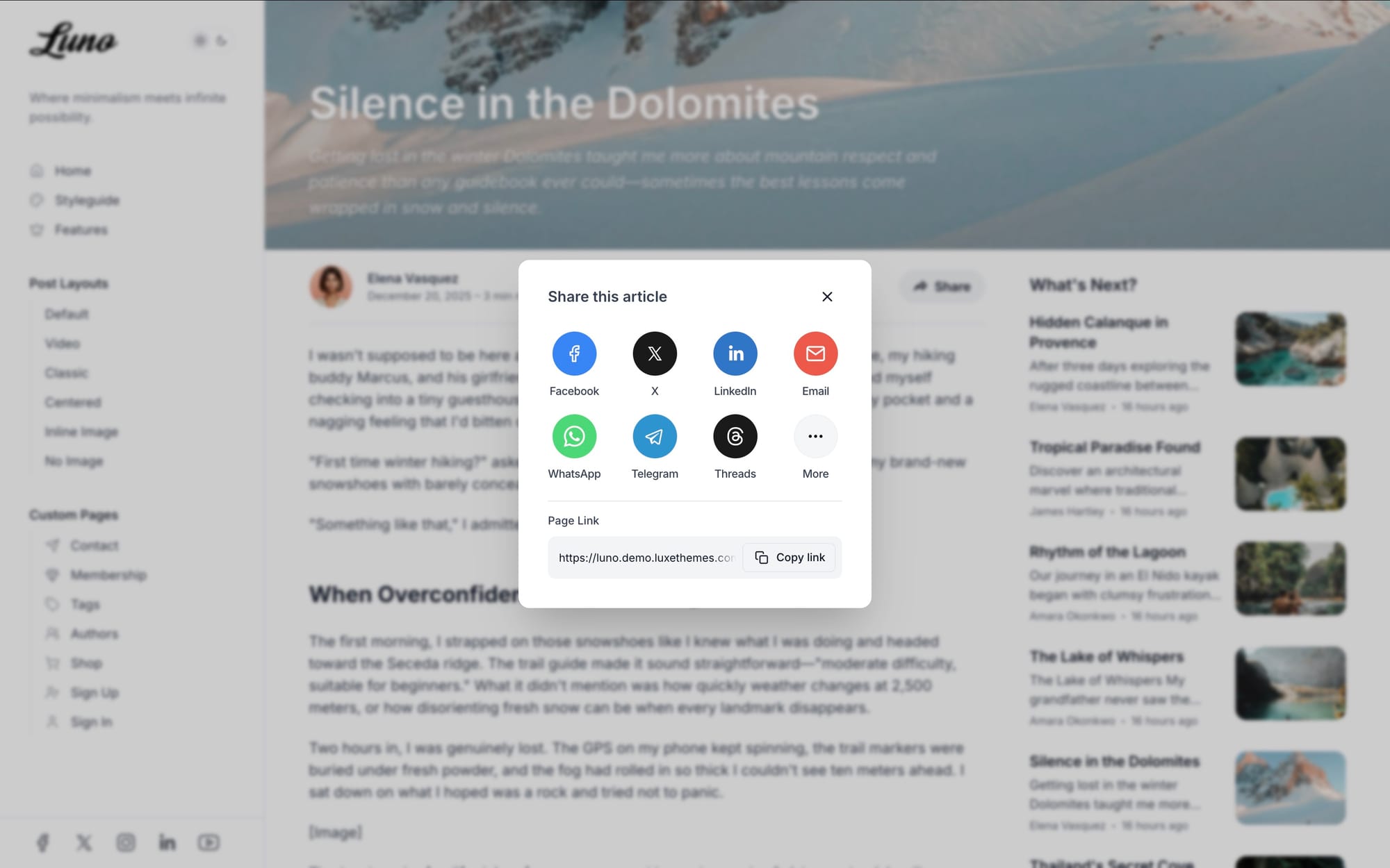
Enhanced Reading Experience
Keep readers engaged with thoughtful features designed for long-form content:
- Table of Contents — Auto-generated from headings with scroll tracking
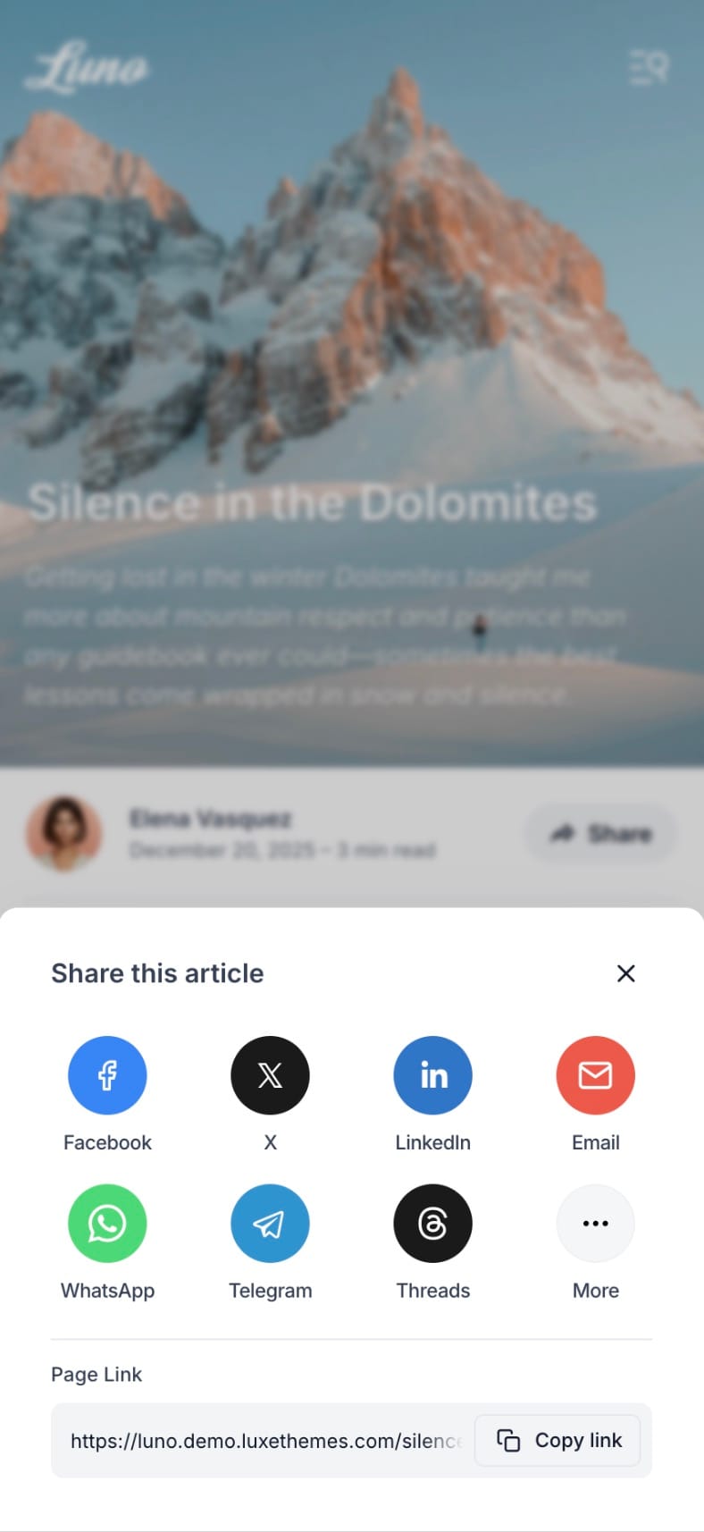
- Social Sharing — 12 platforms including X, LinkedIn, WhatsApp, Threads, Bluesky
- Image Lightbox — PhotoSwipe-powered full-screen gallery with zoom
- Progress Indicator — Circular reading progress with scroll-to-top
- Related Posts — Smart suggestions at article end
- Native Comments — Ghost's built-in commenting with member permissions
Built for Performance
Modern technology stack ensuring speed, accessibility, and global reach:
- Mobile-first responsive design
- Built with Vite + Tailwind CSS v4
- Optimized for Core Web Vitals
- 25+ social platforms supported